We talked about that for a while, as an illustration of how he would paint, and how I paint; we reached a shared understanding.
That got me to thinking: maybe I should explain how I produce these paintings. I've been painting for almost 3 years now, and I know I've improved, but the basic process remains the same - its my skills of execution that have improved.
So, I've decided to show a much more detailed step-by-step guide to how I paint, more than the work in progress shots I do, so I'm using my current commission, from Final Fantasy XI.
I start off by measuring the image I'm working from, and working out its relationship with the canvas I'm painting. The image I'm using is 18 cm by 29 cm, the canvas is 40 cm by 56 cm. This means, that each square on a grid on the image is 4.5 cm by 7.25 cm, and to keep the scale correct, the squares on the grid I draw on the canvas need to be 9 cm by 14.5 cm
I fold the source image into a 4 by 4 grid - I've found folding is better than pencil lines, but that's just what I prefer:

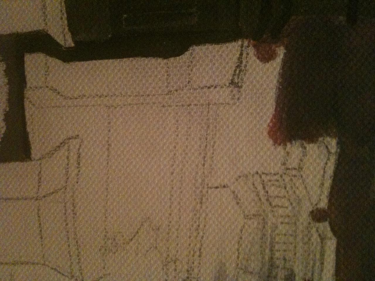
I then draw the grid on the canvas:

Once the grid is drawn, using a 2H pencil, I start at the top left hand corner of the picture, working my way across to the right. I draw what's in each grid in turn, carefully matching up the image where the grid lines cross. I fold the source image up so that I can only see 1 or 2 grids.

I move across the page, rubbing out the grid lines as I finish that grid. I use a putty rubber/eraser, as it doesn't take the finish of the canvas, but absorbs the graphite into itself. I get through a lot of these:

Next stage, doing the foreground.
Again, starting from the left of the picture, I work across to the right - this keeps the canvas relatively clean of pencil smudges, as I'm right handed. I suppose you'd work the opposite way round if you were left handed.
I start adding the details of the buildings on the left.

Once I'm happy with the buildings, I continue across the page.

The clearer my source image, the easier this is. Sometimes, I work from my PC, as I can zoom in on details, so I can see them more easily than from a paper image

Here, you can see I've added in some grid lines for the flagstones. This will help with positioning the figures I'm adding to the image, as I'll be able to scale them well.
Here, I've started drawing in the figures in the foreground. I've enlarged them to the size I want them to be, and cut them out, so I can look closely, to be sure I'm accurate.

I want to change the position of her left arm and hand, so I've not added it in yet.
Here's a closeup of the other figure, partly drawn in.

I wanted them to look like they're walking towards the viewer, but sharing something together, as well.
Here's the finished pencil outline. I'm not happy with the faces yet, but I'm a long way away from painting them, they will be the last things I do, so I have plenty of time to fix them. I find painting faces quite hard, and so will probably do a couple of practice sketches on paper before I finalise them.

Next, the sky. I start off with a slightly thinned down pink at the bottom of the sky. I'm actually painting this upside down, as I don't want to smudge the rest of the picture, but I'll turn it back the right way round before I finish the sky.
Here, I'm trying to get the basic colours right, and have started with the pink sunset afterglow, and will gradually darken and make it more blue as I work up the canvas.

I've painted over some of the smaller structures, but around the larger ones. As the paint is thinned down, those structures I've painted over are still visible enough for when I paint them in, so it doesn't matter.

I've turned the canvas back the right way up, now, and am going over the thinner paint with more colour, to give it more depth, and to correct any errors I've made. I really like painting in acrylics, specifically because of their flexibility - even if you make a real mistake, you can just paint over it and start again, something you can't do with watercolours.
The thing about skies is that they are never a uniform colour, even a completely clear sky, the colours change as you look towards the horizon. With a sunset, any slight atmospheric disturbance will change the colours. I really like skies. I painted the moon in last, and then dragged a wet brush across the darker edge, so that it blurred into the sky.

Next, I'm starting the buildings. As the image I'm copying is quite dark when printed, I'm using my PC to see more clearly, and to zoom in on the part of the painting I'm working on.

For some reason that's beyond me, this image wants to be the wrong way up. Lewie will fix it later.
I've spent about 2 hours so far on the buildings - first of all, blocking in the colour of the walls, then adding in some detail, using my PC as a source for the image.

One of the problems I sometimes encounter is smudging the pencil outline, and making the canvas dirty. Its a bit frustrating, and sometimes means I smudge over already painted parts, which is why I work from left to right, and from top to bottom - sometimes, though, I can't help smudging. It doesn't matter so much on this painting, as the colours are quite dark, but on others, its been a problem.
I rub out my pencil outline as I go along, to try to stop this from happening, but you can see on this close-up, that its been a bit of a problem here.
I'll be doing some more of the buildings in the background over the weekend, aiming to start the foreground next week.
Here, I've continued working accross the picture, from left to right. I'm completing the skyline in stages:

Here, I've done the central roofs, and started the blocking in of the parts of the curtain walls that jut out on the right. I have to think about how the light from the moon will fall on the jutting out bits, and which bits would be in shade, otherwise, the picture will look very flat.

In this image, I've carried on with the curtain walls, and I've also outlined the fountain and planters in dark grey, diluted paint. This is because the canvas (and my hand) is getting very dirty from the pencil smudging, so with the paint outline, I can erase the pencil marks.
I'm happier with the right hand side than I am with the left - I think the building angles look better, so I'll have to have a think about the shading i've used, and maybe darlen some areas and lighten others. Just in case you didn't realise, the darker bits recede/are in shadow, and the lighter bits come forward/ are in the light (allbeit moonlight in this picture), and that's how you get a more 3d effect in a painting.
I still have the central building to complete, and the water coming down from the tall structures centre left on the painting. I'll do them next, then I will be able to start on the middle ground of the painting.
Its so tempting to do the two characters now, but that will make it too complicated, as I'll have to paint around them, instead of overlaying them onto the background. Patience!
I've completed the central building, I've built it up in several shades of grey, using the darkest for the tall, thinnest parts, to make the stand out against the sky:

I've also made a start on the foreground - starting diagonally from the left. This section is paving flags, so I will be adding in lines to represent the joints in the flags. This will give greater depth to the painting, as the flags, although square, look diagonal and appear bigger at the front of the painting than in the middle. I have already drawn the lines in pencil, so I'll be painting them in next.

I've carried the flags right up to the first character, outlining her carefully with a very fine brush, then sweeping the colour up with a thicker brush. I've tried to keep the colour fairly unmixed, to try to recreate the colour variance of the flagstones.

Once the flagstones are complete, I'll be painting in the grass the fountain and the other structures in the centre of the painting, as well as the trees in the background. Then, I'll start on the two figures.

Here's a bit more done - I've done some work on the fountains and the pots/urns in the centre, concentrating on the shading to make sure they look 3d, and then I've done the trees. Unfortunately, I forgot to take progres shots of the trees whilst i was painting them, so I only have the finished trees to show in close-up:

I paint trees by first painting in the trunk and branches, then adding smaler and smaller branches and twigs, to create the overall shape of the tree, then i add individual leaves or groups of leaves, using a very fine paintbrush. I use several shades of the same green, slightly lightening or darkening it as I go along. If you ever look really closely at a tree, the leaves aren't uniform in colour - younger leaves tend to be a little lighter, the undersides aren't quite the same shade as the tops of the leaves, and as the wind blows, different parts of the leaves are visible.
If I'm doing a painting like My Neighbour Totoro, that has a largeish tree in the foreground, I will paint splodges (such a technical word!) of several shades of green all over the tree canopy, then paint individual leaves on to of the splodges, that way, I get a good range of shade and light, without having to paint on hundreds of individual leaves.

Here's a close-up of the left hand side of the painting, I've almost finished the background.

Here's the right hand side.
And here's a higher resolution image of the painting so far:

As I've said, I need to add the water from the fountains and the grout in the flagstones. I'll be using a very dilute light grey wash for the water, and a mixture of darker and lighter greys for the grout, and will hopefully be doing that tomorrow.
In this image, I've added the wash for the fountains, and painted in the avatars. Except for their faces. I struggle with faces, the more realistic they are, the harder I find them to paint.

The next few photos show the finished picture, all taken with my camera, instead of my phone (!), one with the flash, the rest without:


The picture with the flash shows the colours more accurately, but the detail of the fountains is too washed out. Here's a few close-ups of the painting:

If you look carefully, you can see the fountains in the mid-ground - I painted the water using a very dilute light grey wash, building it up slowly until I was happy with the effect.


I'm happier with the face on this avatar than on the other - I practised them both several times on spare paper before trying them on the painting, but still found them difficult. I'm going to have to spend some time practising drawing and painting face.
Well, you've seen how I paint a picture now, from start to finish, I hope this encourages you to have a go yourself. the more you paint, the better you get, having critical, honest feedback from others is really useful, and has helped me improve over the last 3 years.